中国银行是中国国际化程度最高的商业银行。1929年,中国银行在伦敦设立了中国金融业第一家海外分行。此后,中国银行在世界各大金融中心相继开设分支机构。目前,中国银行拥有遍布全球28个国家和地区的机构网络,其中境内机构超过10000家,境外机构600多家。1994年和1995年,中国银行先后成为香港、澳门的发钞银行。
在近百年辉煌的发展历史中,中国银行在中国金融史上扮演了十分重要的角色。中国银行于1912年由孙中山先生批准成立,至1949年中华人民共和国成立的37年间,中国银行先后是当时的国家中央银行、国际汇兑银行和外贸专业银行。
随着业务的发展和管理的改进,中国银行在80年代开始进行CI设计工作。于1980年,中国银行香港分行与12家中资银行推行电脑化联营,靳与刘设计接受委托设计行标。行标设计是将古钱币与“中”字结合,赋予简括现代的造型,表现了中国银行资本、银行服务、现代国际化的主题。
中国银行的商标,在80年代首先在香港使用,并在1984-1985左右应用到内地的中银。1986年,中国银行总行选定了此设计为行标。 这是近代中国商标的典范。事实上,这也是中国银行业史上第一个银行标志。后来工商等银行的商标,虽有国家级专家设计,评价者普遍说是受中银的标志设计的影响。
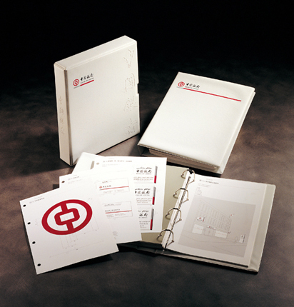
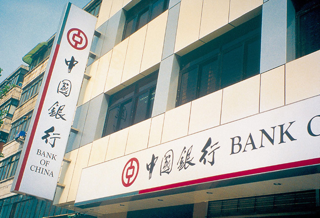
“中国银行”四个字是郭沫若的手笔,经靳与刘略作修改,成了金字招牌。但即使设计了一个好商标,还是有问题——中银全国约有一万家分行,若他们对商标的用法极不统一,也成不了良好的企业形象。于是靳先生特别为其设计了一个企业形象识别系统,说明在面积、长度不同的空间,要怎样使用这个商标;若空间太长,那商标和文字可怎样重复。靳与刘还提出了一个革命性的设计,就是在标牌系统上选用白色作底色。在当时中国没有一家银行是用白底的,一般的固虑是白色不耐脏,但换一个角度来看,保持一个银行的标牌光亮如新亦是一个国际性银行应表现的标准。这么多年来中银以一个高度証明这片白的大气与优雅,这成为同行仿效的标竿。
中国银行的行标,充分体现“真善美”三项条件。行标有真的形象,真的本质;有完善的理念;更具有前瞻性。以结绳的铜钱为创意基本出发点,结合“中”字的字形结构,与企业名和银行企业特性完美表现。中国银行的CI设计手册,经过长时间规划。每一项应用设计都不是纸上谈兵,而是经过实践,针对困难去解决问题,脚踏实地去做。
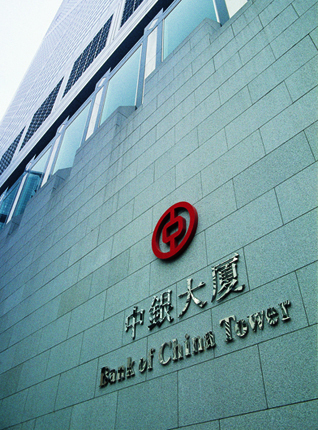
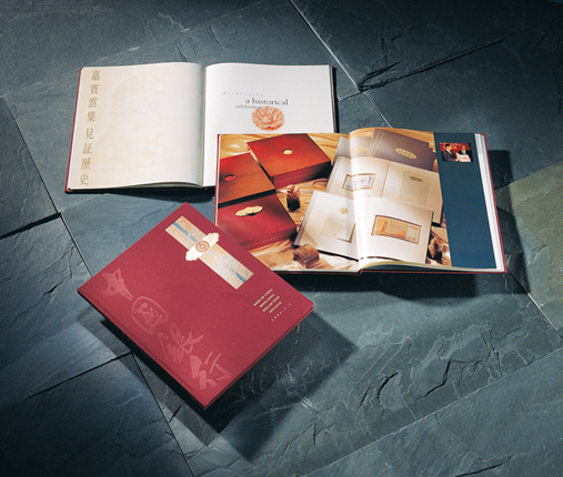
1990年,由美籍华裔建筑师贝聿铭设计,位于美利楼原址兴建的中银大厦启用,正式成为中银在香港的新总部。中银大厦成立之时又为其设计对外包装与一系列的推广设计。
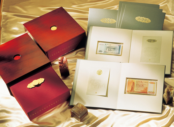
1994年,中国银行在香港发行港币钞票是一项历史盛事,靳先生受邀参与钞票设计的顾问工作,亦创作了部分CI,再将中国银行的企业形象衍生出许多新形象。
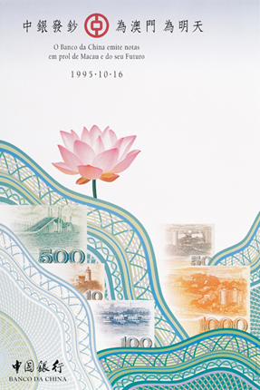
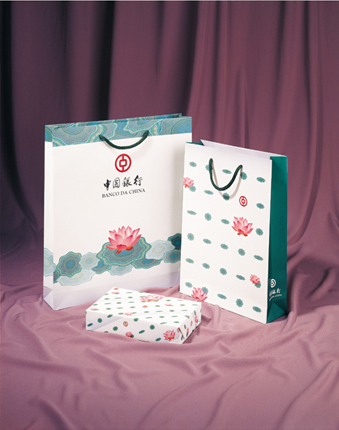
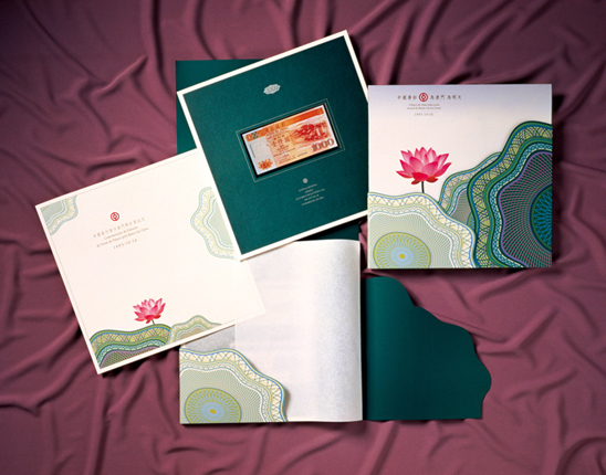
1995年,中国银行在澳门发行澳门钞票,又是另一项历史盛事。以香港经验为本,靳先生再次创作了一套完整度更高的发钞推广小CI。以澳门市花“莲”为主题,结合钞票的视觉元素与中国银行的形象,设计出了灵活多变的新
Bank of China, or Bank of China Limited in full, is one of China’s four state-owned commercial banks. Its businesses cover commercial banking, investment banking and insurance. Members of the group include BOC Hong Kong, BOC International, BOCG Insurance and other financial institutions. In terms of tier one capital, it ranked 10th among the world’s top 1,000 banks by The Banker magazine in 2008.
Bank of China is the most internationalized commercial bank in China. It has built up a network in 27 countries and regions. Currently, it has over 10000 domestic operations and over 600 overseas.
Over the past century, Bank of China played an important role in China’s financial history. Established in 1912 being approved by Sun Yat-sen, it served as the central bank, international exchange bank and specialized foreign trade bank until the founding of the People’s Republic of China in 1949.
As its business grows, Bank of China started working on the design of corporate identity in 1980s. Bank of China invited Kan & Lau to design a new logo. The design integrates the Chinese character “中” into an ancient coin, giving it a simplistic modern look, to express Chinese capitalism, banking services, and a globalized approach.
The logo was first adopted by BOC (Hong Kong) and was officially approved in 1986. It was the first bank logo among Chinese banks and became a classic example of Chinese logos. Logo designs of various Chinese banks are believed to be influenced by the logo of BOC.
The calligraphy of the “Bank of China” was titled by the late Chinese writer Guo Muo-ruo. After modified by Kan & Lau, it became the bank’s signature. Even with an outstanding logo, an unifying logo system is required for corporate identity consistency. Kan then created a corporate identity recognition system to help adjusting the use of the logo. It suggests how the logo and the signage should repeat itself if the space is too long. Another groundbreaking suggestion by Kan & Lau was the use of a white background as no other banks in China would since it is not durable, however, it keeps the signage fresh and radiant.
The logo of BOC is a representation of the concept “genuineness, integrality, and beauty” which conveys the authentic image of the bank. It is based on an ancient copper coin. Using the Chinese character “中” as the central feature, it reflects the totality of the name and its core business functions. The design for BOC’s corporate identity underwent long planning process, since every application design is not simply an idea on the drawing board, but is accomplished by tackling difficulties working concretely.
The Bank of China Tower, designed by Chinese-American architect I.M. Pei, inaugurated in 1990 and became the new Hong Kong headquarters of BOC. Kan & Lau again designed a series of packaging and promotional items for its inauguration.
Bank of China became one of the banknotes issuer in Hong Kong in 1994. To commemorate the event, Kan was invited to provide consultation to banknote designs and created part of their corporate identity.
Bank of China later became one of the banknotes issuer in Macau in 1995. Using the experience in Hong Kong, Kan created a series of banknotes with even greater integrality to promote corporate identity. The symbolic city image – water lily is used as the thematic design. On its release, the commemorative set gained tremendous popularity as a collector’s treasure. Kan was proud of the hype, and declared, “A design is not good enough only if the designer says so. It is more important that the public agrees and recognizes the success.” The success of the Bank of China project received widespread recognition and appreciation which could inarguably be selected as Kan’s greatest work in his career.


