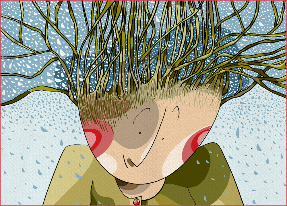


Kiekvienas žodis perteiktas grafito linija ir skaitmeninės grafikos spalomis. Siekta išlaikyti rankos piešinio gyvybingumą ir pritaikyti skaitmeninės iliustracijos galimybes – tradicinių ir naujųjų grafikos technologijų sampyną. Didelis dėmesys skirtas kiekvieno puslapio kompozicijai, atvarto grafinei kalbai, spalvų paletėms, išryškinant raudonumo akcentus. Pateiktas, teksto autorės teigimu, unikalus mįslių ir kituose dvilapiuose komponuojamų elementų sprendimas. Vyrauja teksto ir jo atsklaidos grafinėje plotmėje harmonija – kai žodis tampa vaizdu, o vaizdas – žodžiu; kai iliustracija pavirsta minties naratyvu, kelione, individualiai interpretuojamo pasaulio atodanga.
Ypatingas dėmesys skirtas piešinio ir suvokėjo pokalbiui, raudonumą apipinančių lietuviškų žodžių unikalumo atsklaidai grafinėje plotmėje. Linija, spalvinė dėmė, subtili tekstūra ir aukštos kokybės jautriai spaudai pritaikytas G-print popierius – pagrindinės priemonės, leidusios sukurti prabylantį, vaizduotėje atgyjantį ir skaitytojo atmintį pasiekiantį vaizdą.
Unikali daugialypė knygos struktūra – tai spalvingas, dinamiškas, gyvas žodžio ir piešinio pasaulis. Pasaulis – sukurtas jam – skaitytojui.
Iliustr. ir diz. Laimutė Varkalaitė
Leidykla Lieparas
Spausdino Taurapolis
206×289 mm
104 p.
Kietas įrišimas
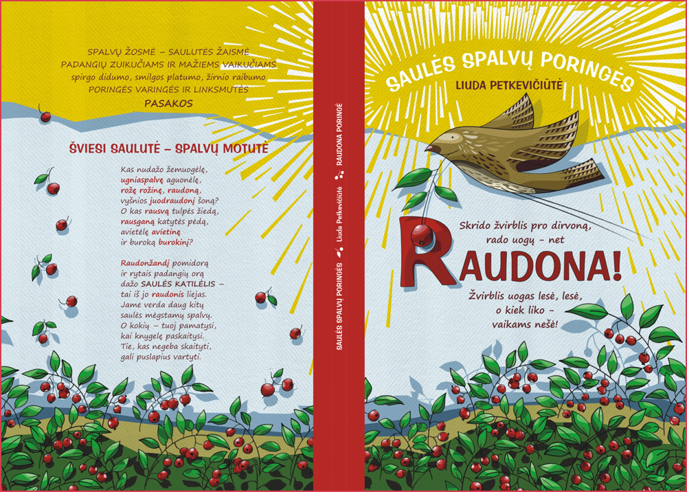
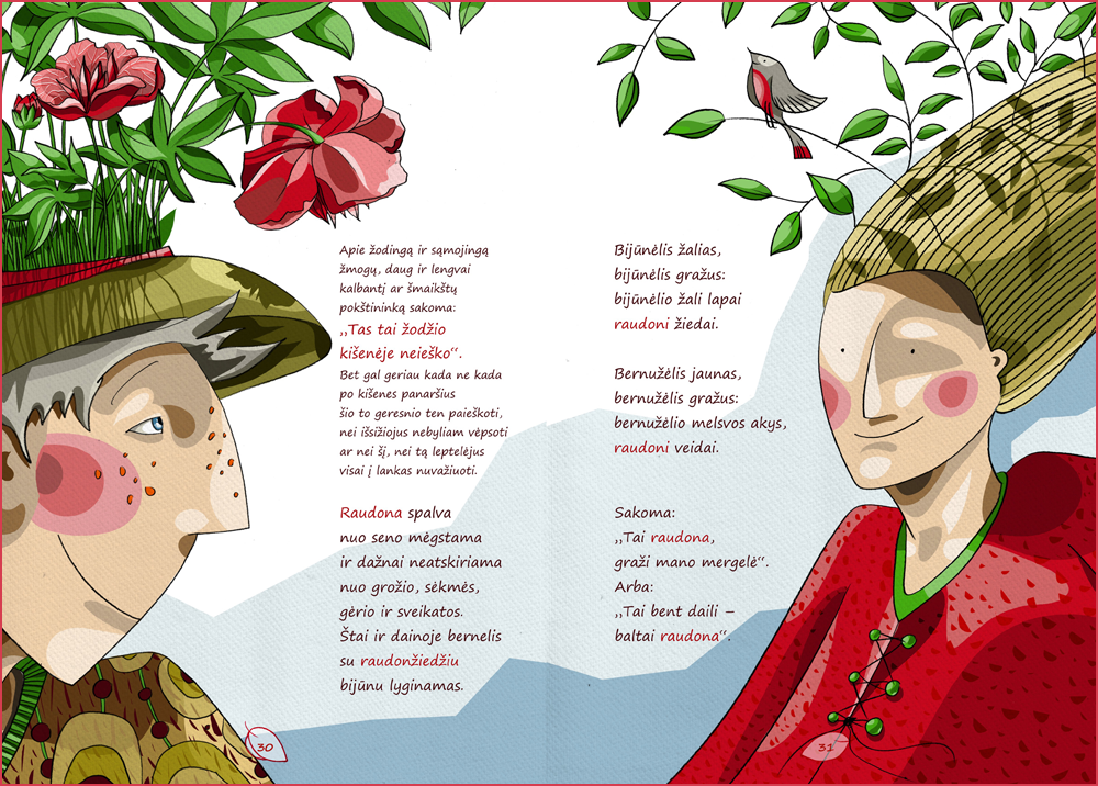
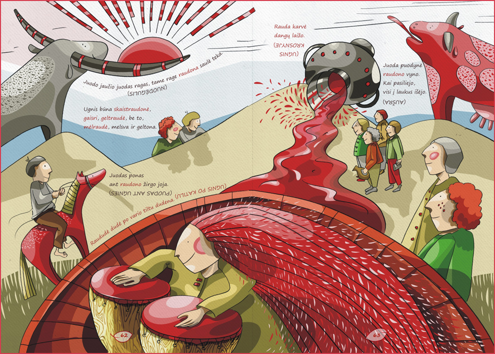
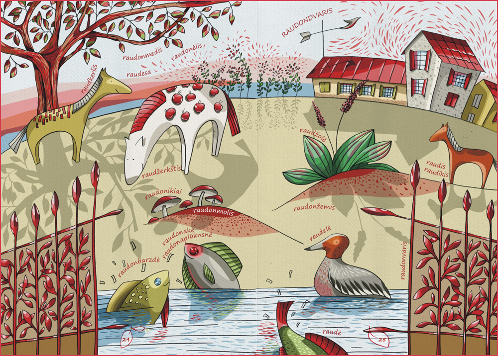
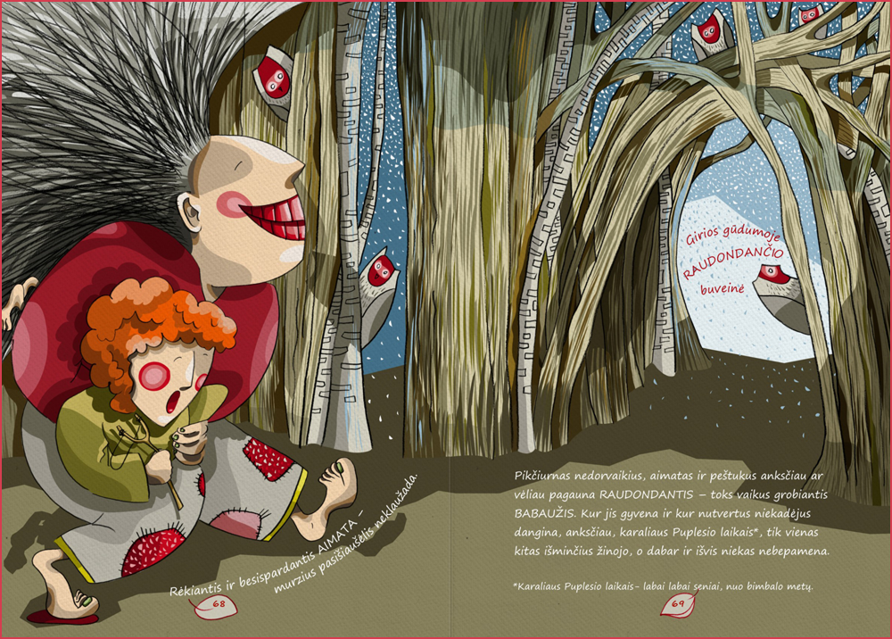
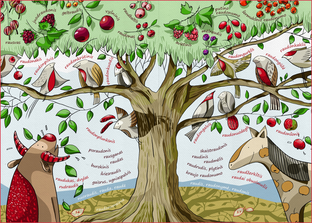
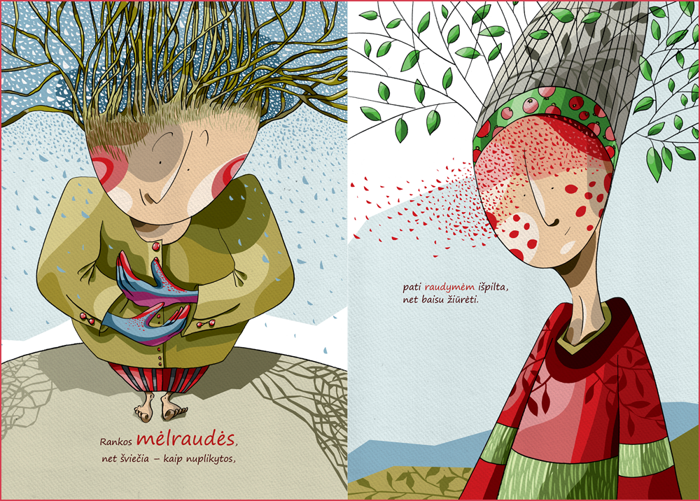
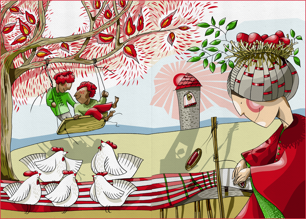
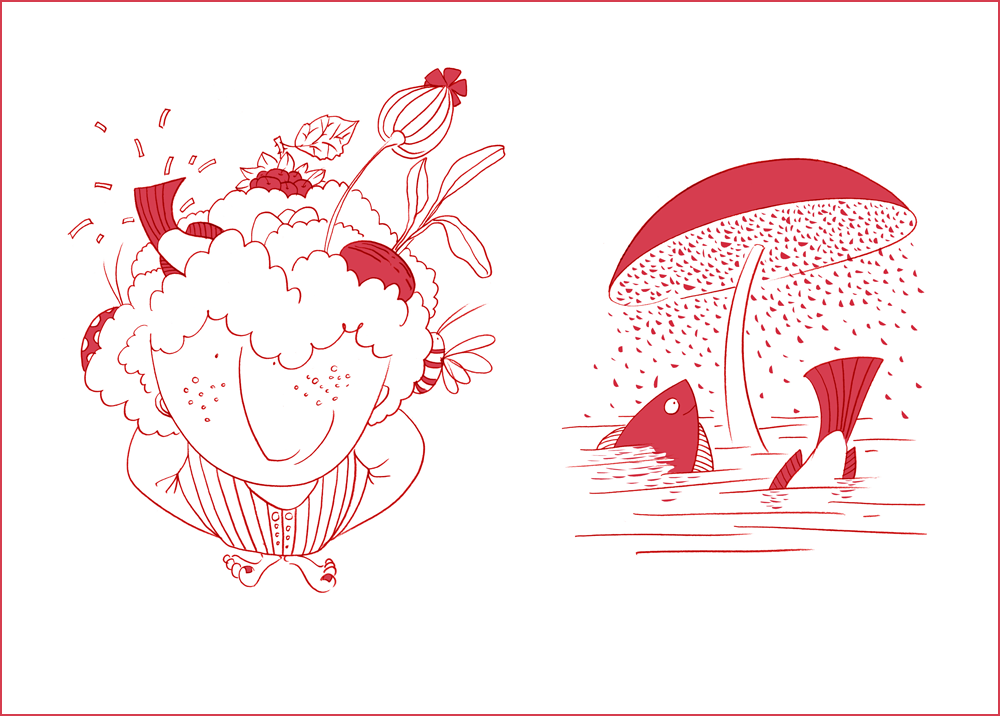
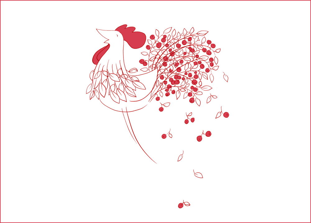
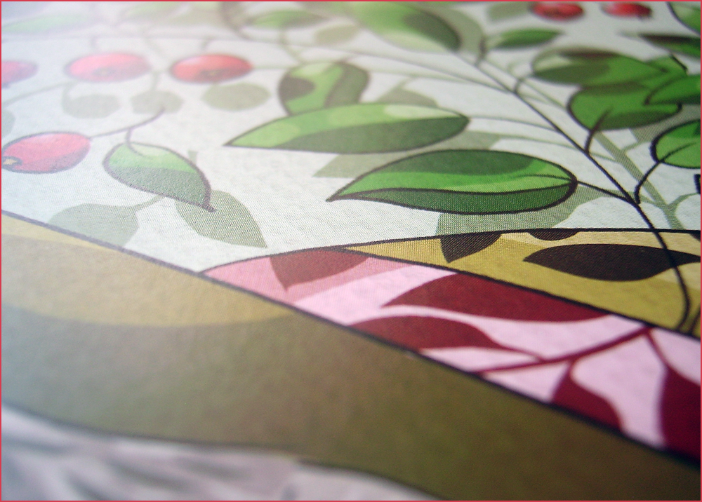
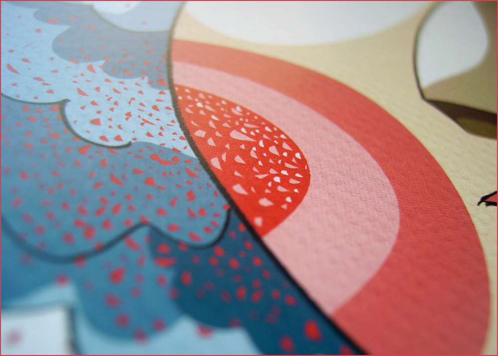
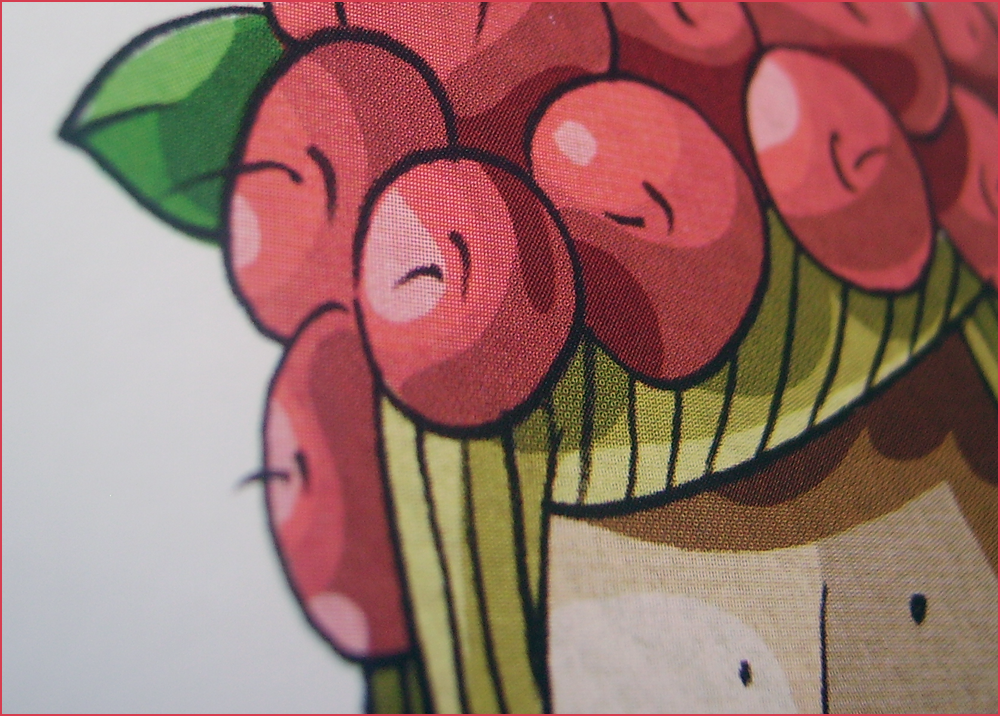
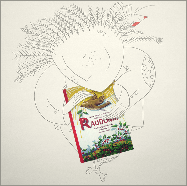
TALES OF THE SUN. RED – is educational book for children and whole family. Its mission – to reveal the richness of the Lithuanian language illustrating a plenty of the synonyms of a red color. Comparisons, riddles and tales are parts formating an unique structure of the book which are talking about the red poppies, berries, red-cheeked children and Red-teeth kidnapper, about a stork with his red long legs, the red sun rising in a horn of an ox and a red flamed hair witch knocking under the copper bridge and about a dream of the ladybird – a red garden strawberry and other images which reveal a wide palette of the red.
Each word is illustrated by using a graphite line and colors of a digital graphic. The aim was to keep a vitality of a hand drawing and to adapt facilities of digital illustration – a junction of traditional and new graphic technology. A great attention was given to a composition of each page, to a graphic speech of spread, to palettes of colors highlighting the red accents. There was presented, as an author of the book said, an unique compositional solution of riddles and other elements in spreads. Harmony between a text and illiustrations – is a dominating aspect in a book; when a word becomes an image and vice versa; when the illustration turns to a narrative of a mind, a travel and a presentation of an individual interpretation of the world.
A special attention was given to a communication of the reader and the book and to revelation of the Lithuanian words of red meaning in a graphic field. A line, a color stain and a fine texture and a high quality G-print paper for a special printing – are the main graphic instruments which allowed to create an image which speaks, revives in imagination and reaches the memory of reader.
An unique and multifaceted structure of the book – that is a colorful, dynamic, vivid world of a word and a drawing. The world – which was created for him – for reader.
Printed by Taurapolis
206×289 mm
104 p.
Hardcover