


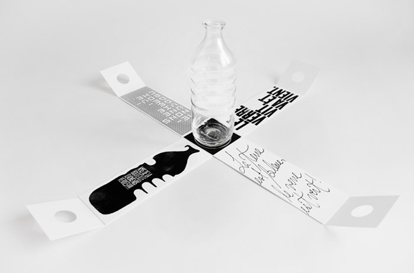
Marketing and communications specialist Gauthier have sent out a limited run of glass water bottles as a gift to its clients with an environmental message to choose glass over plastic. The packaging’s minimal/maximal design approach, taking a simple white rectangle and imparting a strong and inspiring visual message on the interior walls, utilises its gift proposition to defy retail convention and deliver subtlety first and impact second.
营销和传播专家 Gauthier已向其客户发送了数量有限的玻璃水瓶作为礼物,其中包含选择玻璃而非塑料的环保信息。包装的最小/最大设计方法,采用简单的白色矩形并在内墙上传递强烈而鼓舞人心的视觉信息,利用其礼品主张来挑战零售惯例,首先传递微妙,其次才是影响。
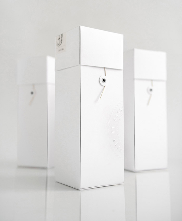
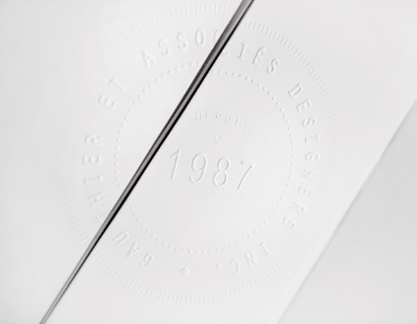
To produce an uncoated, square and white structural design solution with a simple blind emboss, encouraging the recipient to look closer and physically engage with the pack through subtle texture, is a smart and unusual direction that substitutes initial shelf impact for enquiry, reflecting its non-retail proposition and the craftsmanship of glass making. What this reverse approach does is to build a sense of intrigue and appropriately follows it up with a striking black and white typographical and illustrative interior that through language attempts to establish an emotional relationship and reflect the philosophy of the brand.
制作带有简单盲压花的无涂层、方形和白色结构设计解决方案,鼓励接收者近距离观察并通过微妙的纹理与包装进行物理接触,这是一个聪明而不同寻常的方向,它用最初的货架冲击代替了询问,反映了它的非-零售主张和玻璃制造工艺。这种反向方法的作用是建立一种阴谋感,并适当地用引人注目的黑白印刷和说明性内部来跟进它,通过语言试图建立一种情感关系并反映品牌的哲学。
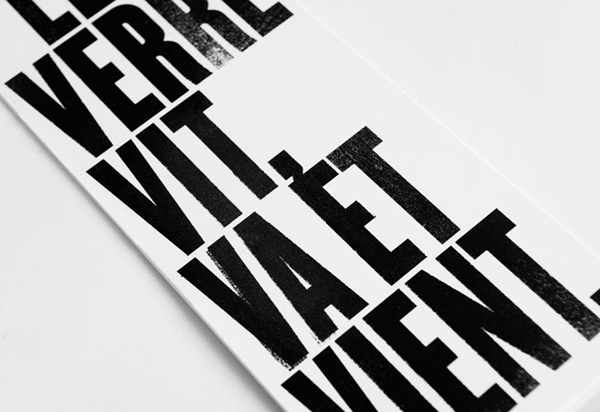
The the interior content roughly reads:
内部内容大致如下:
“The earth is blue, the glass is green” “The glass comes and goes” “…. a life uncorked” “enough of the bottle, raise our glasses”
The interior conveys a number of glass-based (and environmental) messages through a striking monochromatic juxtaposition of tall geometric, distressed and impersonal letter-forms – reminiscent of Soviet propaganda and reflecting the theme of resistance – alongside the organic, personal and hand-drawn qualities of the script – a sense of love, care and attention to detail. A smart contrast of aesthetics that add an expressive but thoughtful dimensionality to the character of the brand.
“地球是蓝色的,玻璃是绿色的”“玻璃来来去去”“…… 不加塞的生活” “瓶子够了,举起我们的酒杯”
内部通过醒目的单色并置高几何、苦恼和非个人的字母形式传达了许多基于玻璃(和环境)的信息——让人联想到苏联的宣传并反映了抵抗的主题——以及有机的、个人的和手绘的剧本的品质——爱、关怀和对细节的关注。美学的巧妙对比,为品牌特征增添了富有表现力但深思熟虑的维度。