Katowice Street Art Festival – silkscreen poster series
Dynamics, diversity, uniqueness, manifesto – these are the key words used to define Street Art by the organizers of the festival in Katowice. The visual identity of this event symbolized the collision of often juxtaposed energies stemming from the art of the street and liberated for the duration of the festival.
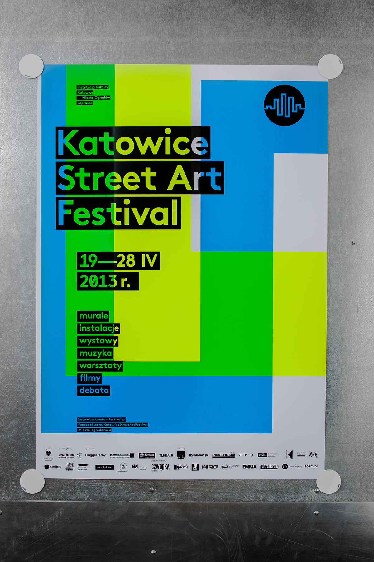
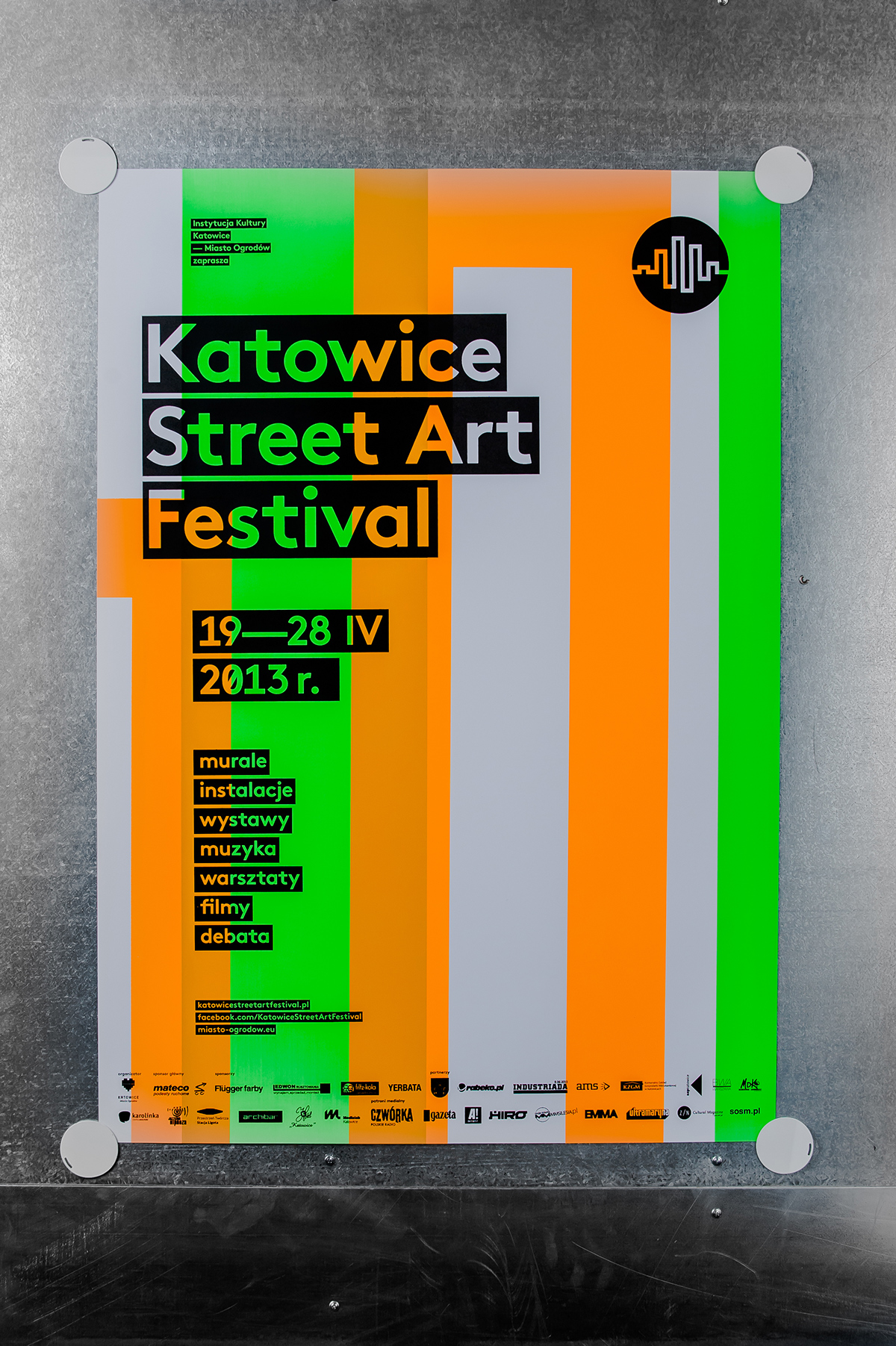
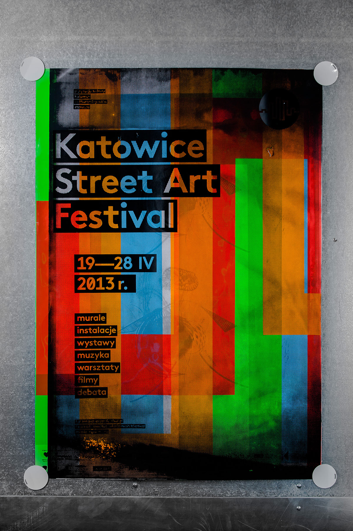
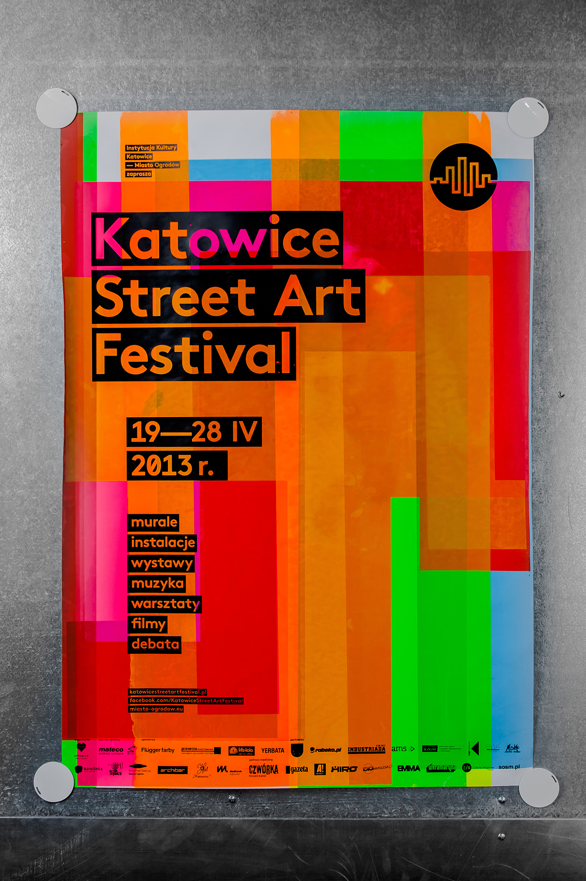
Events taking place during the festival make the city come alive, burst with colour, undergo a visual transformation. Filling public space with posters announcing the festival was an integral part of these events. Solvent-based screen printing paints in six different neon colours were used in the production of these posters. These paints have a very high intensity, so the posters were very expressive, they stood out from the background, it was hard not to notice them – they were screaming!
When designing the festival identification system it was crucial for that process to closely resemble that of the street artist. The unique disposability of the work was important, randomness, spontaneity. To get this effect the posters were screen printed. A special printing system was developed to allow for a large number of composition variations.
The basis for the identification was a theme lifted from the festival logo, which resembles a drawing of the city. On the basis of the logo six geometric figures were generated, each assigned with one fluorescent color. Six screens with geometric figures and a screen with the typographic layer were prepared. Each poster consisted of two superimposed figures and text information. Because the screen with the figures was able to rotate by 90 degrees, 62 different versions of the poster were obtained. A total of 310 posters were printed.
The screens with geometrical figures used to print posters were re-used to print the festival brochures. After printing the information layer, every format then produced five brochures. Thus a certain randomness was achieved, which allowed for every leaflet to be unique, and the final effect to be unpredictable.
The festival visual identification was completed with a series of gadgets – bags, stickers and buttons – created on the same principle as the posters. A video trailer of the festival was the final element.

动态、多样性、独特性,宣言——这些关键字用于定义街头艺术的组织者在卡托维兹的节日。这个事件的视觉识别标志经常并列的碰撞能量源于街头的艺术和节日期间解放。

事件发生在节日让城市活过来,破裂,进行视觉色彩变换。公共空间填满海报宣布节日是不可分割的一部分,这些事件。溶剂型的丝网印刷颜料在六个不同的霓虹颜色被用于生产这些海报。这些油漆有很高的强度,所以海报非常富有表现力,他们站在从背景,很难不注意到——他们尖叫!

当设计节日识别系统是这一过程的关键相似的街头艺术家。独特的一次性的工作是重要的,随机性,自发性。这个海报是屏幕打印效果。特殊印刷系统,允许大量的成分变化。

识别的基础是一个主题从节日的标志,类似于城市的一幅画。标志六几何数据的基础上生成,每一个分配一个荧光颜色。六个屏幕与几何数据和屏幕准备印刷层。每个海报由两个叠加数据和文本信息。因为数据的屏幕可以旋转90度,62种不同版本的海报。总共有310的海报打印出来。

屏幕与几何图形用于打印海报被重用打印小册子。印刷后的信息层,每个格式然后产生五个小册子。从而达到了一定的随机性,使得每一个传单是独一无二的,和最终的效果是不可预知的。

节日视觉识别完成一系列的小玩意——袋、标签和按钮,创建以同样的原则作为海报。视频拖车节的最后一个元素。

printing scheme – 6 figures that can be rotated 90 degrees + 6 fluo colors
上一篇 下一篇
Katowice Street Art Festival – silkscreen poster series

Dynamics, diversity, uniqueness, manifesto – these are the key words used to define Street Art by the organizers of the festival in Katowice. The visual identity of this event symbolized the collision of often juxtaposed energies stemming from the art of the street and liberated for the duration of the festival.
Events taking place during the festival make the city come alive, burst with colour, undergo a visual transformation. Filling public space with posters announcing the festival was an integral part of these events. Solvent-based screen printing paints in six different neon colours were used in the production of these posters. These paints have a very high intensity, so the posters were very expressive, they stood out from the background, it was hard not to notice them – they were screaming!
When designing the festival identification system it was crucial for that process to closely resemble that of the street artist. The unique disposability of the work was important, randomness, spontaneity. To get this effect the posters were screen printed. A special printing system was developed to allow for a large number of composition variations.
The basis for the identification was a theme lifted from the festival logo, which resembles a drawing of the city. On the basis of the logo six geometric figures were generated, each assigned with one fluorescent color. Six screens with geometric figures and a screen with the typographic layer were prepared. Each poster consisted of two superimposed figures and text information. Because the screen with the figures was able to rotate by 90 degrees, 62 different versions of the poster were obtained. A total of 310 posters were printed.
The screens with geometrical figures used to print posters were re-used to print the festival brochures. After printing the information layer, every format then produced five brochures. Thus a certain randomness was achieved, which allowed for every leaflet to be unique, and the final effect to be unpredictable.
The festival visual identification was completed with a series of gadgets – bags, stickers and buttons – created on the same principle as the posters. A video trailer of the festival was the final element.

动态、多样性、独特性,宣言——这些关键字用于定义街头艺术的组织者在卡托维兹的节日。这个事件的视觉识别标志经常并列的碰撞能量源于街头的艺术和节日期间解放。

事件发生在节日让城市活过来,破裂,进行视觉色彩变换。公共空间填满海报宣布节日是不可分割的一部分,这些事件。溶剂型的丝网印刷颜料在六个不同的霓虹颜色被用于生产这些海报。这些油漆有很高的强度,所以海报非常富有表现力,他们站在从背景,很难不注意到——他们尖叫!

当设计节日识别系统是这一过程的关键相似的街头艺术家。独特的一次性的工作是重要的,随机性,自发性。这个海报是屏幕打印效果。特殊印刷系统,允许大量的成分变化。

识别的基础是一个主题从节日的标志,类似于城市的一幅画。标志六几何数据的基础上生成,每一个分配一个荧光颜色。六个屏幕与几何数据和屏幕准备印刷层。每个海报由两个叠加数据和文本信息。因为数据的屏幕可以旋转90度,62种不同版本的海报。总共有310的海报打印出来。

屏幕与几何图形用于打印海报被重用打印小册子。印刷后的信息层,每个格式然后产生五个小册子。从而达到了一定的随机性,使得每一个传单是独一无二的,和最终的效果是不可预知的。

节日视觉识别完成一系列的小玩意——袋、标签和按钮,创建以同样的原则作为海报。视频拖车节的最后一个元素。

printing scheme – 6 figures that can be rotated 90 degrees + 6 fluo colors
© CopyRight 2011-2020 Mlito.COM Inc.All Rights Reserved . 苏ICP备16061420号 - 1